1. Using the Joblogic Custom Forms functionality
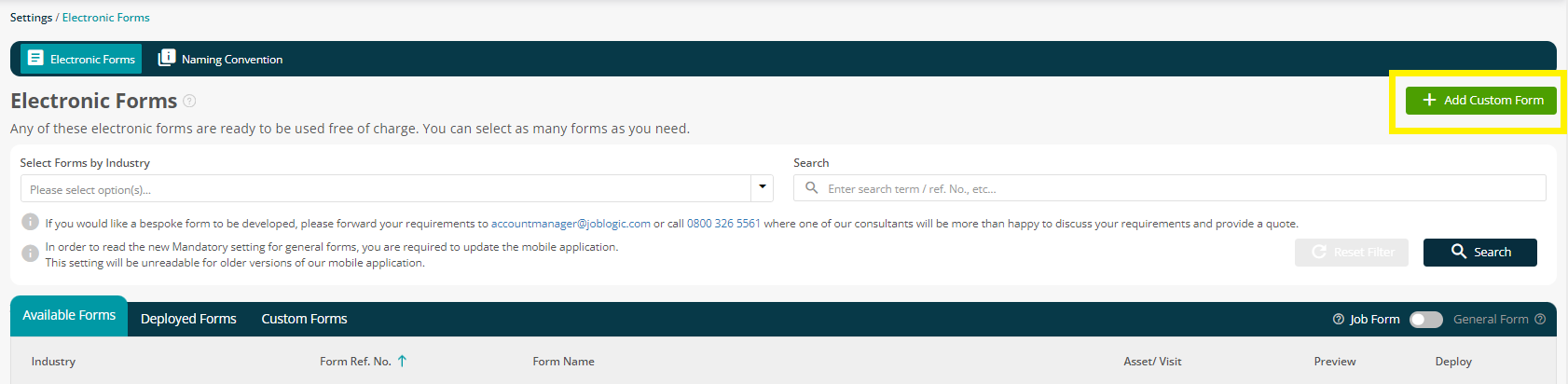
In Settings > Electronic Forms click the ‘Add Custom Form’ action button to start using the Custom Forms module:
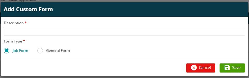
The Add Custom Form screen will be displayed.
Here, you can enter your Form Name, and choose whether it is to be a Job Form (Asset/Visit specific forms) or a General Form (Non-Asset/Visit based, i.e. Vehicle / tool checklists)
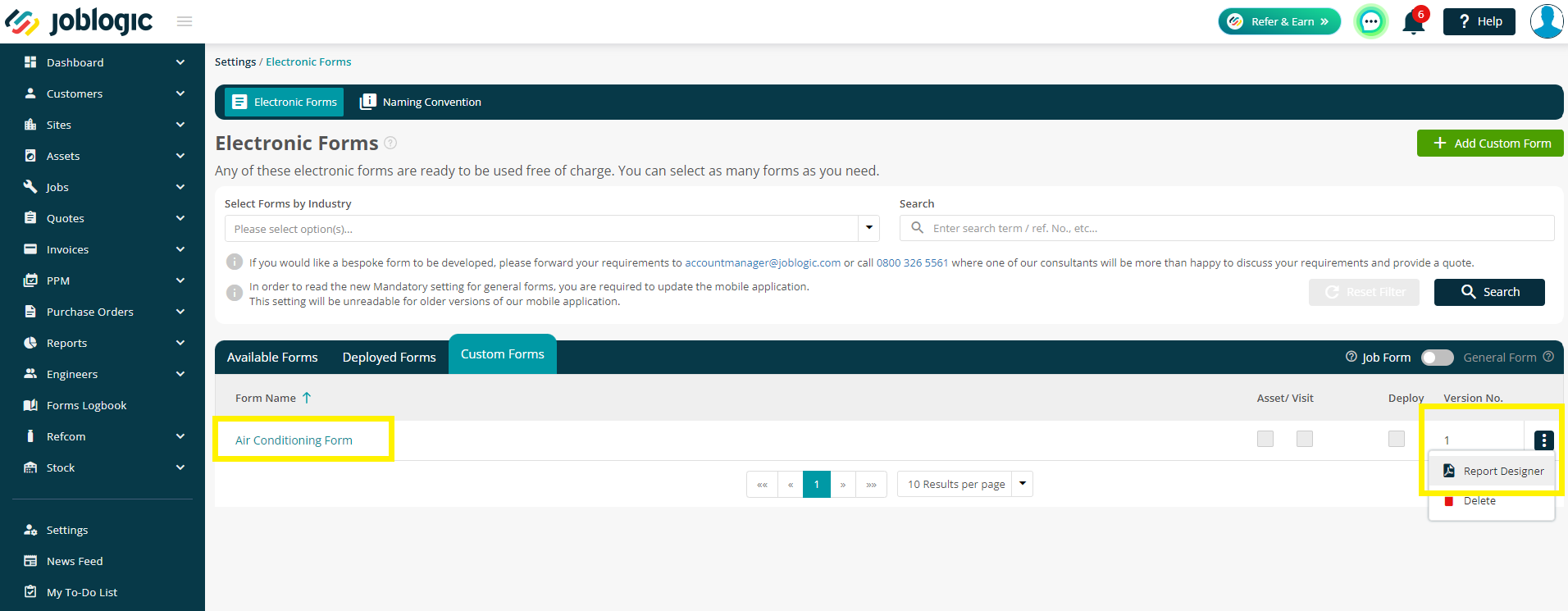
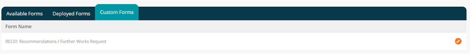
If you have previously saved a custom form and wish to access it to review/edit the form, go to Settings > Electronic Forms and click the Custom Forms tab to view the custom forms in your system.
You can then either click the form name, or click the three dots > Report Designer to starting editing the form.
1.1 The Toolbox / Putting the Form Together
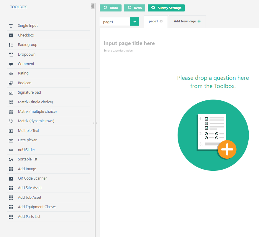
The toolbox is the menu that provides you with all the elements that can be added to your custom form. Each available option is described below.
Please go to the ‘Working with form elements’ section for more details on the options available within each element selected from the toolbox.
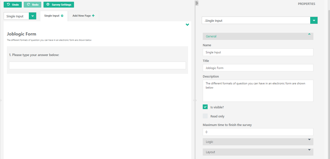
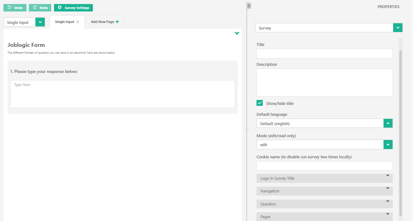
Single Input
The ‘Single Input’ element adds a standard question and single line free text box for responses to your form:
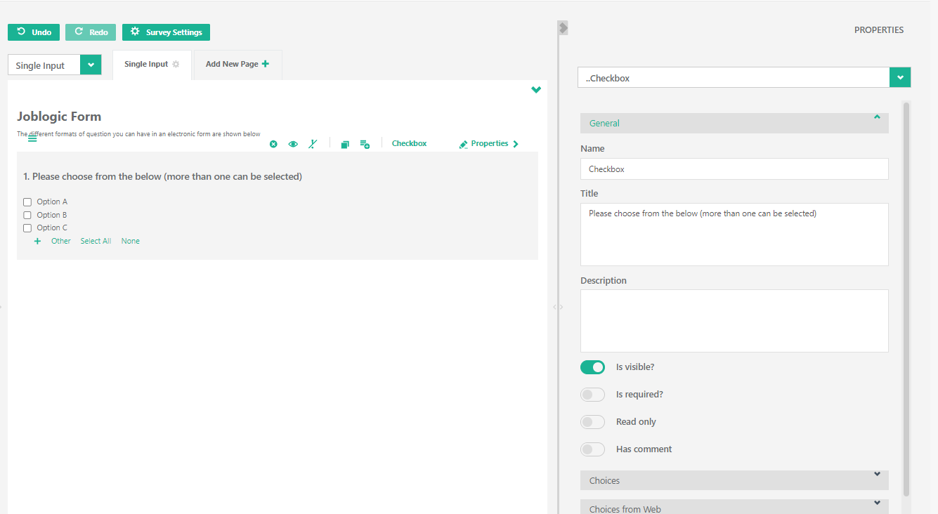
Checkbox
The ‘Checkbox’ element adds a standard question and checkbox responses (i.e. multi selection available) to your form:
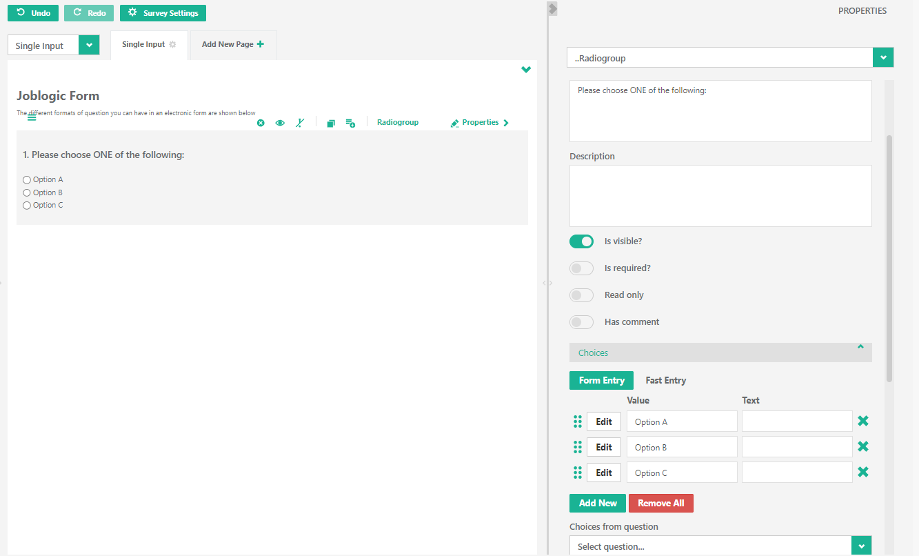
Radiogroup
The ‘Radiogroup’ element adds a standard question and radio button (i.e. single selection only) responses to your form:
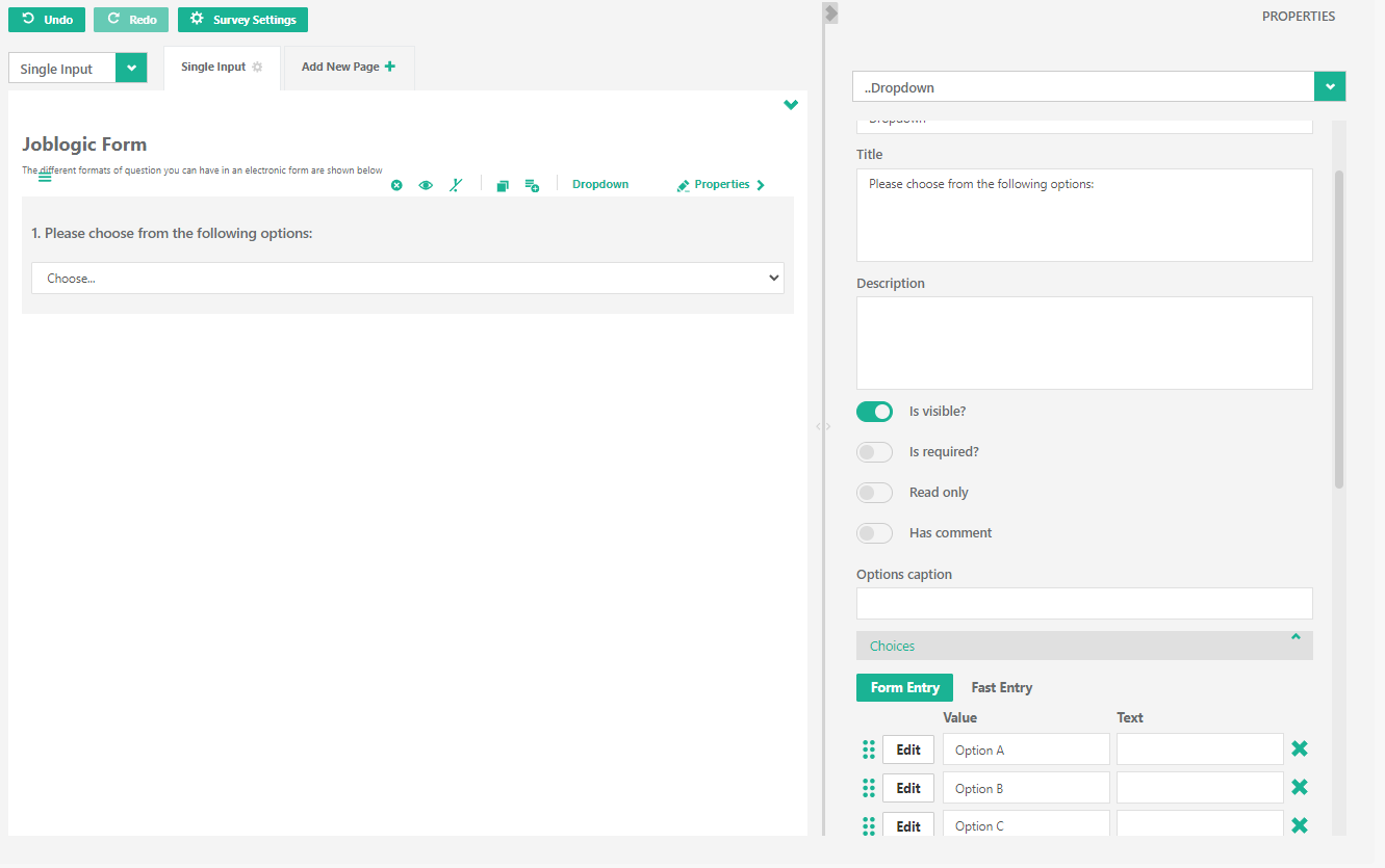
Dropdown
The ‘Dropdown’ element adds a standard question and dropdown field for responses (i.e. single selection list) to your form:
Comment
The ‘Comment’ element adds a standard question and multi-line free text box for responses to your form:
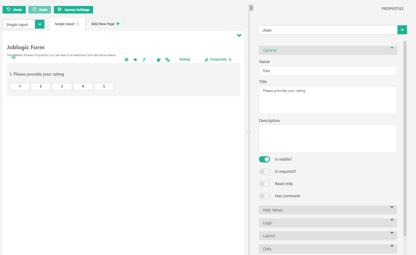
Rating
The ‘Rating’ element adds a standard question and rating bar for responses to your form:
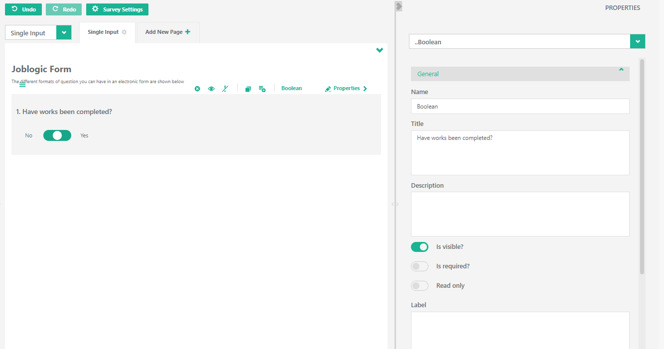
Boolean
The ‘Boolean’ element adds a standard question with a checkbox to your form:
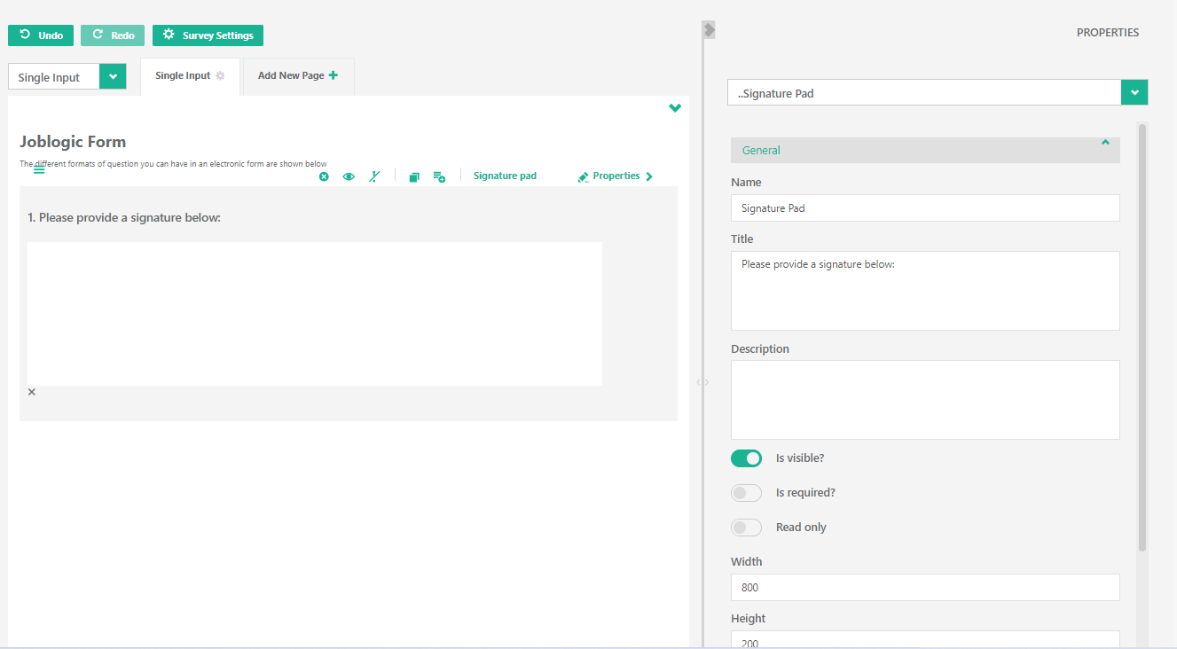
Signature Pad
The ‘Signature pad’ element adds a standard question with a signature pad to your form:
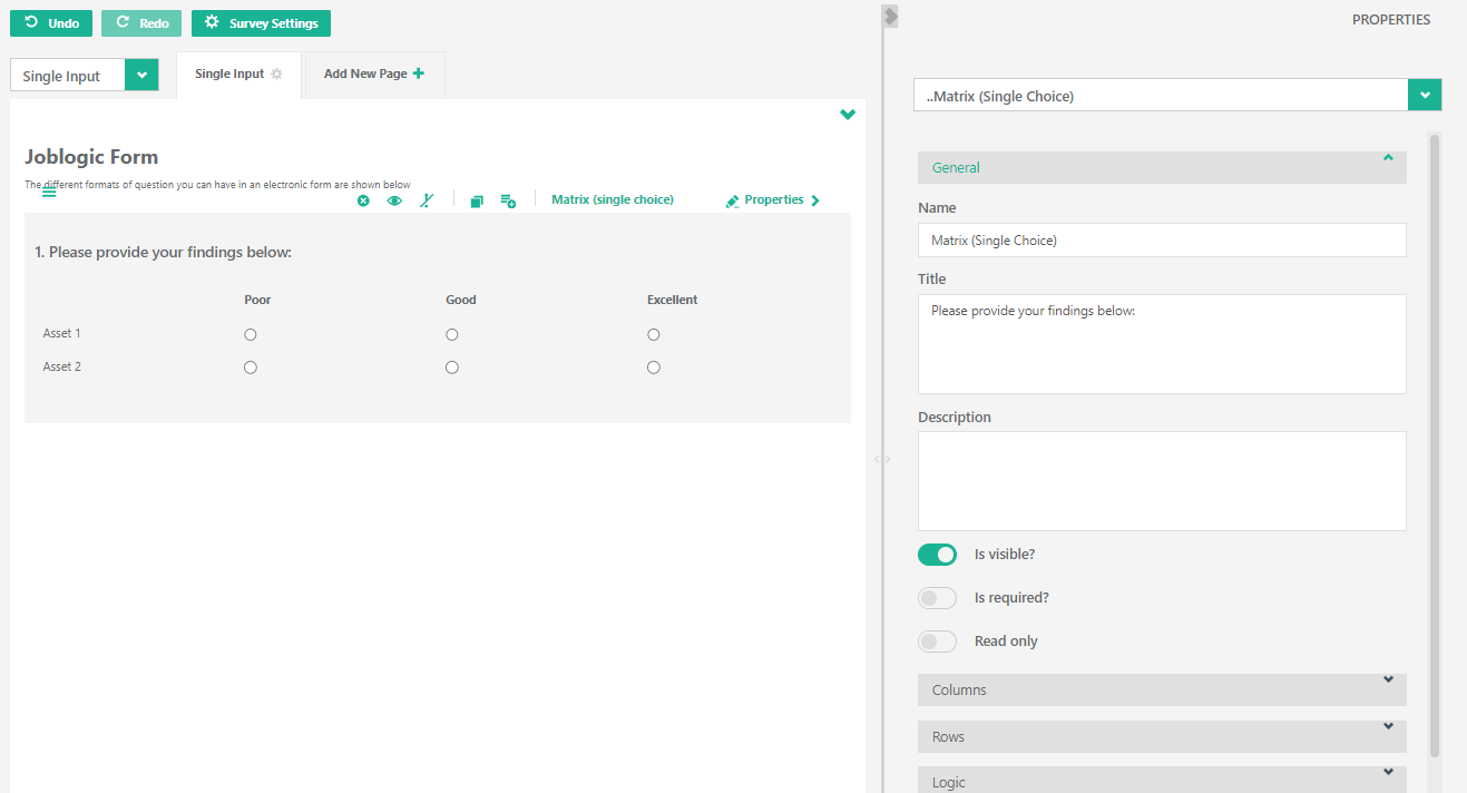
Matrix (single choice)
The ‘Matrix (single choice)’ element adds a standard question with a matrix (single choice per row) for responses to your form:
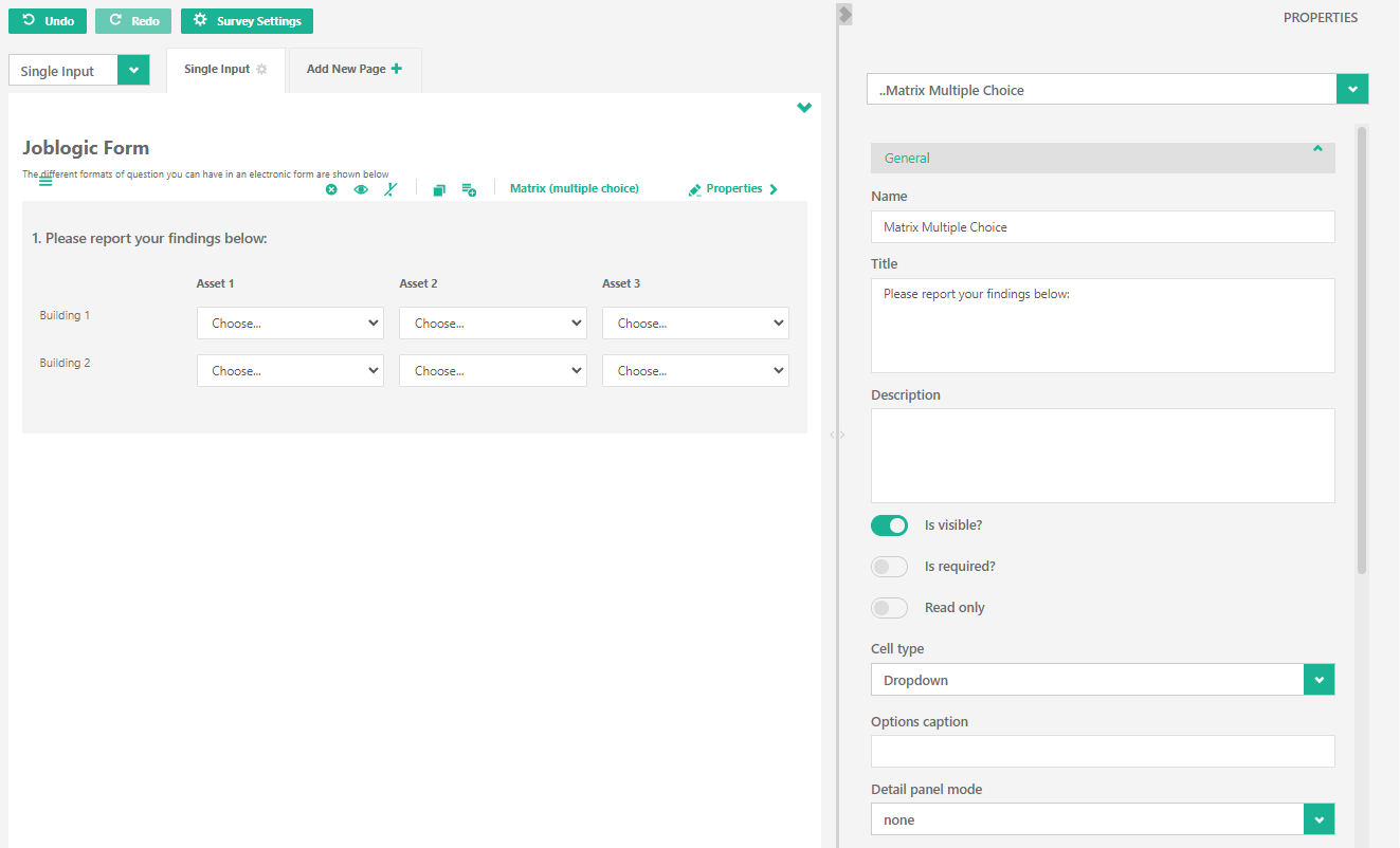
Matrix (multiple choice)
The ‘Matrix (multiple choice)’ element adds a standard question with a multiple choice matrix for responses to your form:
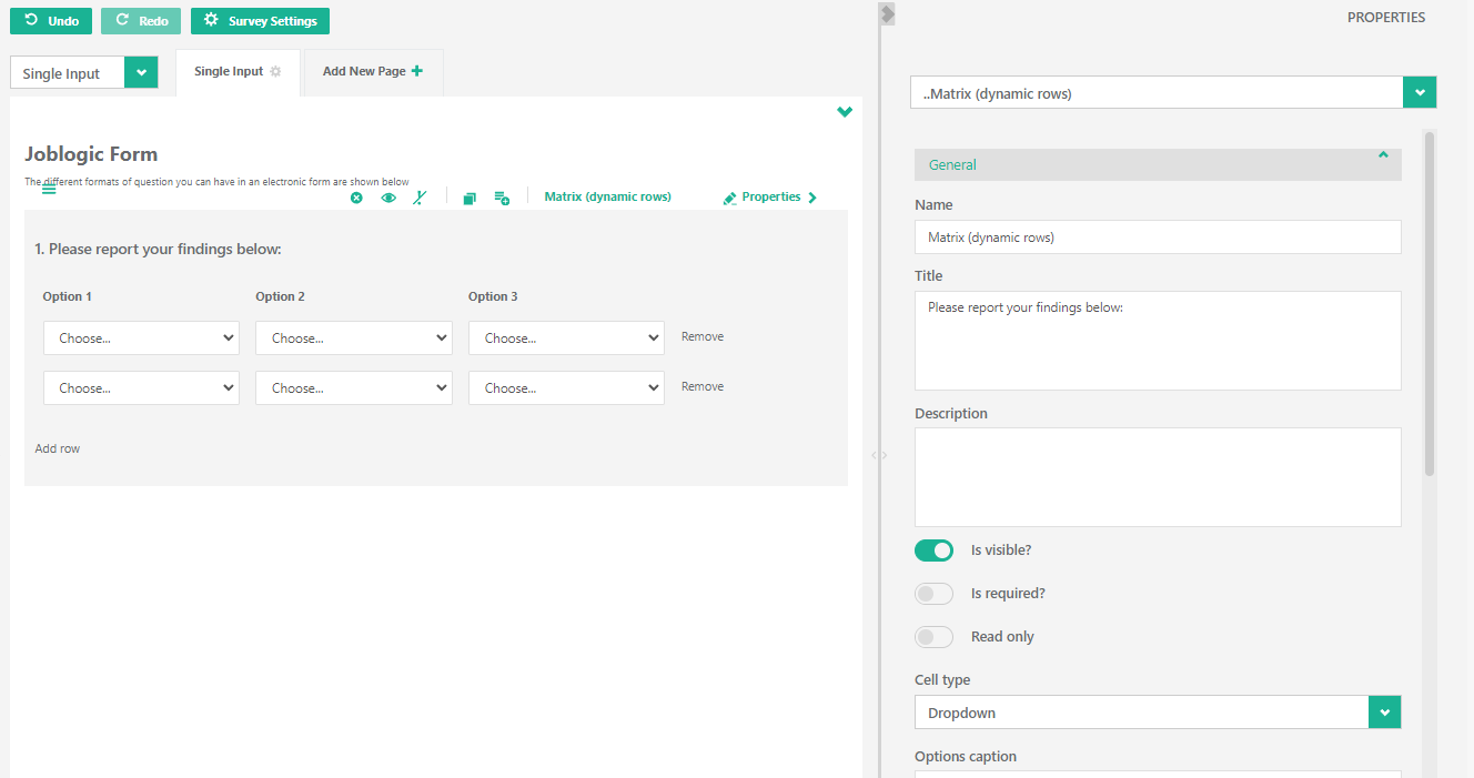
Matrix (dynamic rows)
The ‘Matrix (dynamic rows)’ element adds a standard question with a multiple choice matrix with the ability to add or remove rows for responses to your form:
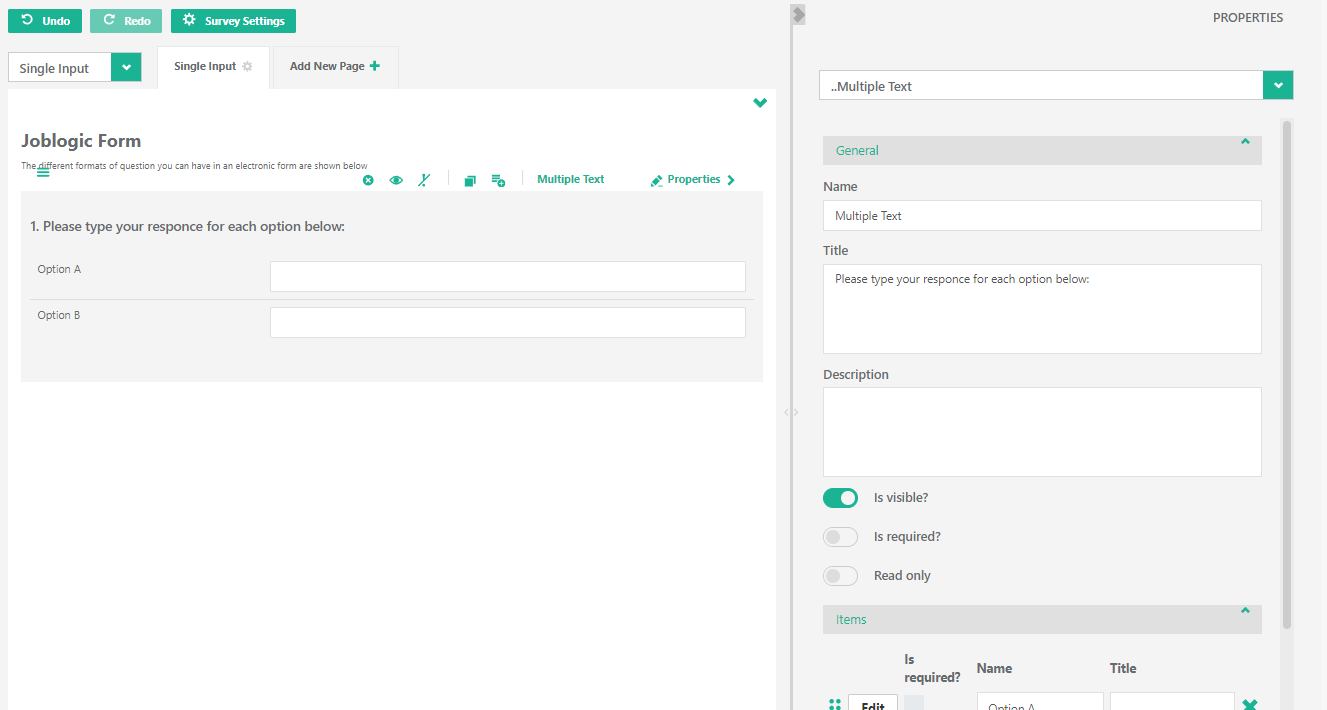
Multiple Text
The ‘Multiple Text’ element adds a standard question with a multiple list of free text box responses to your form:
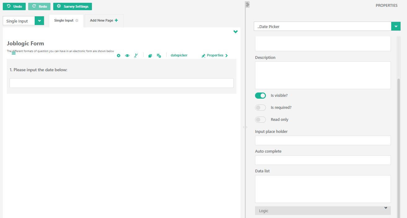
Date Picker
The ‘Date picker’ element adds a standard question with a calendar pop-up for responses to your form:
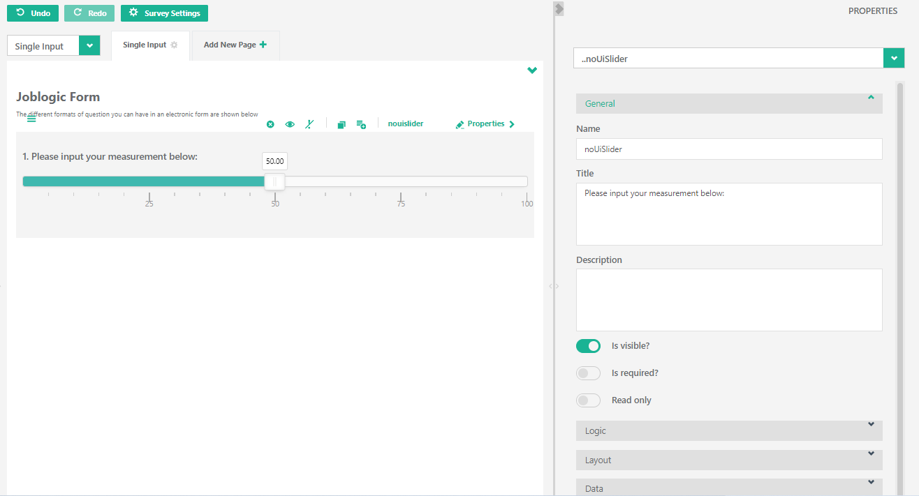
noUiSlider
The ‘noUiSlider’ element adds a standard question with a slider bar for responses to your form:
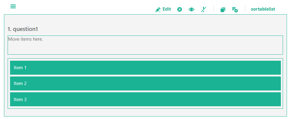
Sortable List
The ‘Sortable list’ element adds a standard question with a panel to drag and drop the required responses to your form:
Add Site Asset
The ‘Add Site Asset’ element adds a standard question with a dropdown selection field to your form:

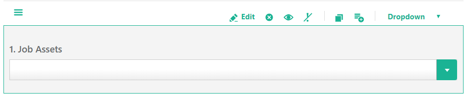
Add Job Asset
The ‘Add Job Asset’ element adds a standard question with a dropdown selection field to your form:
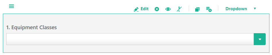
Add Equipment Classes
The ‘Add Equipment Classes’ element adds a standard question with a dropdown selection field to your form:
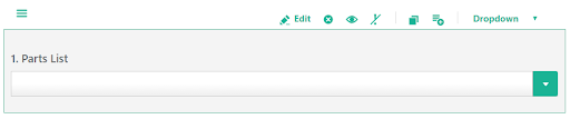
Add Parts List
The ‘Add Parts List’ element adds a standard question with a dropdown selection field to your form:
Add Image
The 'Add Image' element adds a question that can be used to upload an image file to the form.
1.2 Working with Form Elements
Each element that you add to a form has its own menu bar located at the top of that element:

The list below explains what each icon represents within the menu bar:
| Icon | Represents |
|---|---|
 |
This icon allows you to drag and drop the element to re-order the questions. |
 |
This icon allows you to edit the selected question. |
 |
This icon allows you to delete the selected question. NOTE: You will not be presented with an “Are you sure prompt?” when clicking this option.However, it is possible to select the Undo action button if you delete a question by mistake. |
 |
This icon allows you to toggle the title of the question. |
 |
This icon allows you to toggle the ‘Is Required?’ (i.e. Mandatory) status of the selected question. |
 |
This icon copies the selected question and instantly adds the additional copy to your form. |
 |
This icon adds the selected question to the toolbox panel allowing you to place a copy of the question on other pages of your form if required. |
1.3 Editing a Question
Editing a question can be achieved in a number of ways:
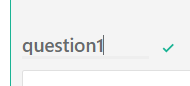
Click the question text and a flashing cursor will appear, simply edit the required text and click the green tick icon or press the carriage return key on your keyboard to save the changes:
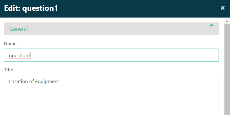
If you click the Edit option from the element menu bar you will be presented with additional options for the question’s name and title (the title is visible to the end user):
Click ‘OK’ to save the changes and close the window or ‘Apply’ to save the changes and keep the window open:

Within the ‘Edit’ screen a number of different options are available depending on the element added to your form. The following describes the different types of options that may be available within the ‘Edit’ screen:

The ‘Is visible?’ checkbox is used to get or set the visible property for the question (normally you will leave this ticked and then use the VisibleIf property to control this – see the section below for more details on the VisibleIf property).

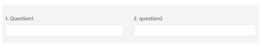
The ‘Is start with new line?’ checkbox allows you to place the selected question to the right of the question above it, for example with this checkbox deselected the end result is:
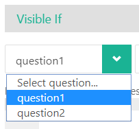
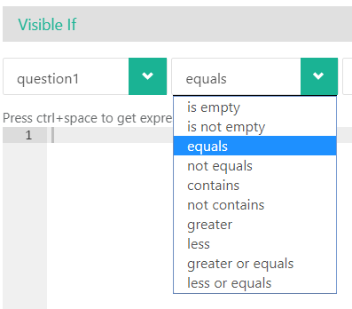
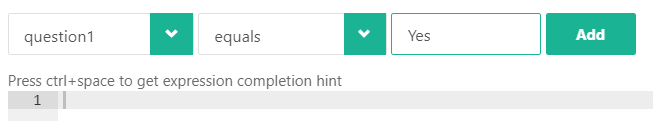
The ‘Visible If’ property allows you to define expressions that will either result in the question being visible or invisible:
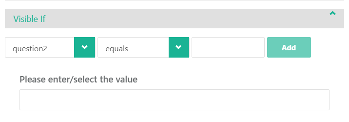
Select the required question to check for the required value from the question dropdown field:
The middle dropdown field provides you with a list of ‘operators’ to test the value against the selected question:
The final field allows you to enter the required value you are checking for, click the Add button to add the expression to the ‘Visible If’ property:
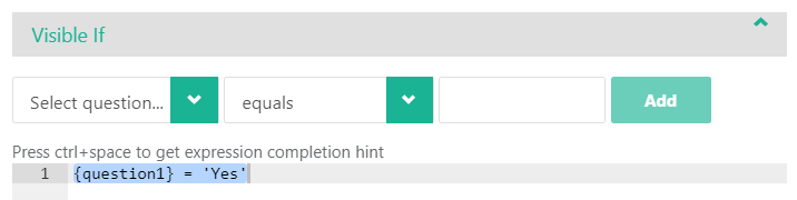
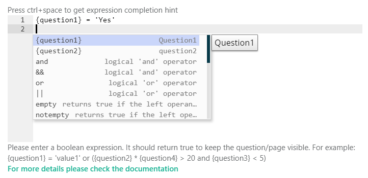
If you prefer the more technical approach of adding expressions to the ‘Visible If’ property you can use the section below the dropdown fields detailed above.
Press ctrl + space for expression completion hints and select the “For more
details please check the documentation” link if you require further instructions on
completing the required expression.
The ‘Enable If’ property allows you to define expressions that will either result in the question being available to interact with or not (i.e. the question will still be visible but potentially not editable):
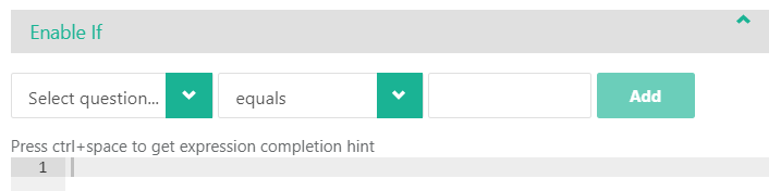
For details on building expressions see the section above for ‘Visible if’
1.4 Questions with Choices
The choices property is available within Checkbox, Dropdown and Radiogroup question types:
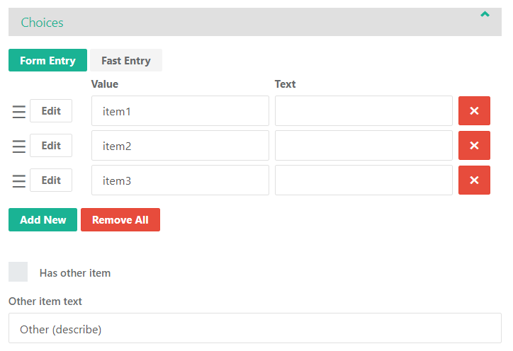
In the default ‘Form Entry’ view it is possible to reorder the choices by clicking the button (left click, hold and drag and drop the selected choice into the required position).

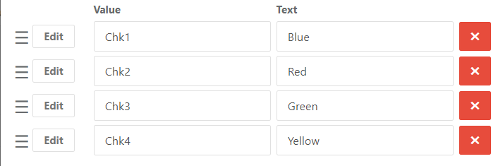
The Value column allows you to define the hidden ‘name’ for the choice (potentially leave this as populated unless you have something very specific you wish to refer to when building expressions).
The Text column allows you to define the wording the end user will see for that specific choice, for example:
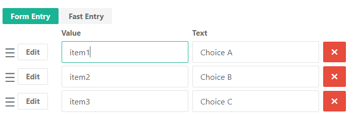
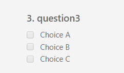
Results in the following within the form:
To remove a choice from the question click

To add an additional choice to the question click

To remove all choices from the question click

If you want to simply enter a list of choices quickly click the  button to switch to the following view:
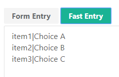
The ‘Pipe’ character (Shift + \ key is the standard shortcut on a UK Keyboard
layout) is used to separate the Value and Text for the choice.
Example, entering the details below in the ‘Fast Entry’ screen:
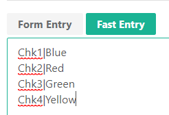
Results in the following within the Form Entry screen:
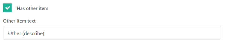
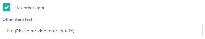
The ‘Has other item’ checkbox adds a choice to the question that allows free text to be entered against the choice, you can change the wording the end user sees by entering the required text in the ‘Other item text’ box:
Example question with the ‘Other’ choice:
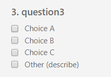
Once the ‘Other’ choice is selected the textbox appears:
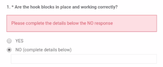
One use of this ‘Other’ choice could be a radiogroup for a Yes/No or Pass/Fail response where you want additional notes to be recorded, the example below demonstrates how you can configure this type of question:
Select ‘Radiogroup’ from the toolbox to add the Radiogroup type question, click the Edit button to enter the edit question screen:
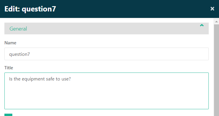
Enter the required text for the question in the Title field:
Scroll down to the ‘Choices’ section and click on it to expand the section:
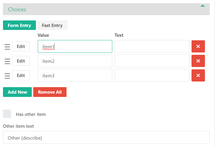
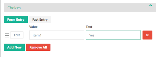
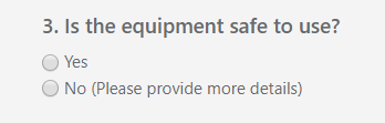
Delete item2 and item3 from the list of choices and enter Yes in the Text field for item1:
Click the ‘Has other item’ checkbox and update the ‘Other item text’ field with the required wording for the No response:
Click OK to save the question.
The end result:
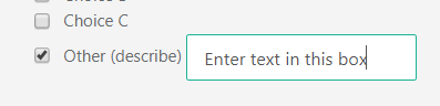
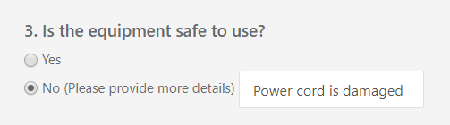
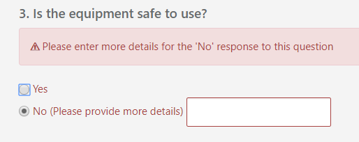
If the user selects the ‘No’ choice they are presented with the text box to enter further
details:
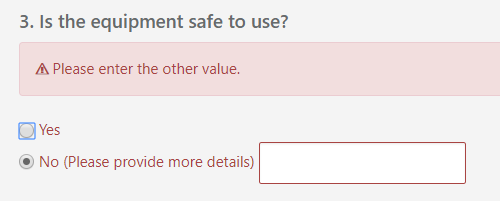
If the user attempts to continue without entering any text they receive the default error message ‘Please enter the other value.’:
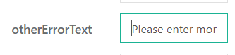
To customise the error message displayed scroll to ‘otherErrorText’ in the right-hand edit panel:
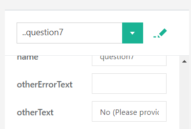
Example:
‘Please enter more details for the ‘No’ response to this question’ has been entered into the ‘otherErrorText’ field.
The entered text is displayed instead of the default error message:
1.5 Working with Form Pages
To add a new page to your form you can either select ‘Add New Page’ from the page dropdown field or click the plus icon to the far right of the page tabs:
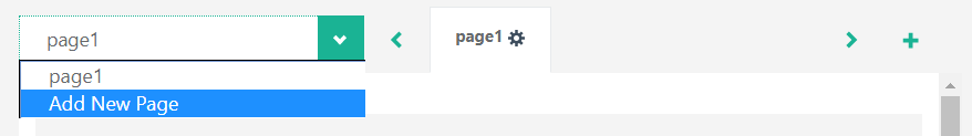
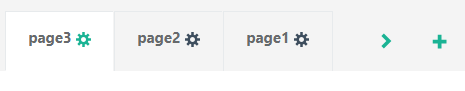
The new page tab will appear to the right of the existing page tabs:
drag and drop the tabs to reorder pages in your form if required:
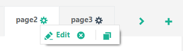
When you click on a page tab or hover your mouse pointer over the active page tab (click the tab to make it active) you can access the tab context menu:
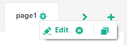
This context menu has 3 options available, Edit, Delete Page and Copy Page.
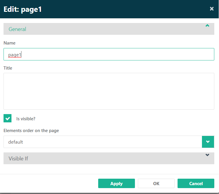
Clicking the Edit icon displays the Page edit screen, within this screen you can enter a title for the page (visible to the form user) and configure the ‘Visible If’ property:
The Delete Page option does not prompt for confirmation, however, if you
have deleted the page in error you can click the Undo action button to retrieve the
deleted page:

The Copy option instantly creates a copy of the active page and places the page to the right of the last page tab.
1.6 Testing the form in Joblogic
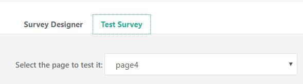
The form can be tested at any point during creation by clicking on the ‘Test Survey’ tab, you can select specific pages to test from the dropdown list if required:
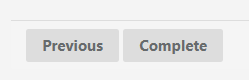
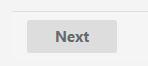
Alternatively, you can start completing the questions and use the page navigation buttons (Next, Previous and Complete if using the standard navigation button text) to work through your form:
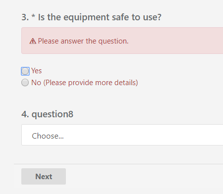
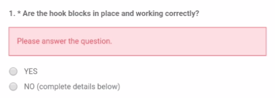
If questions have been flagged as ‘Is required?’ and no response has been selectedprior to clicking the page navigation buttons you will see the relevant error messages for those questions:
1.7 Using the form in the engineer mobile application
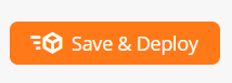
Click the ‘Save & Deploy’ action button to deploy your custom form to the engineer mobile application:
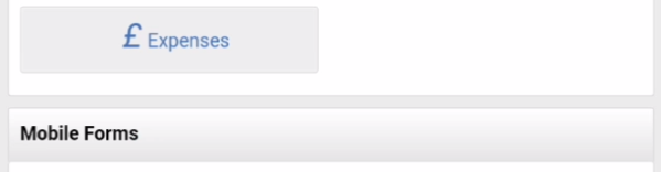
Within a job visit on the engineer mobile application where the visit status is ‘On Site’ scroll down to the ‘Mobile Forms’ section under the ‘Visit Actions’ section of the visit screen:
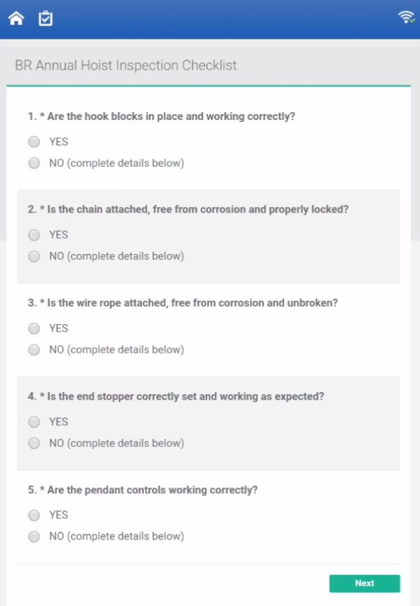
Tap the required form within the list to load the form:
Example of the warning message displayed if mandatory questions are not answered prior to clicking the page navigation buttons:
Example of the warning message displayed if the text box for the ‘Other’ choice has not been populated prior to clicking the page navigation buttons:
2. Using the Report Designer
Once you have created your custom form you will need to use the Report Designer to configure the required output. The example below will provide an overview of using this feature within Joblogic.
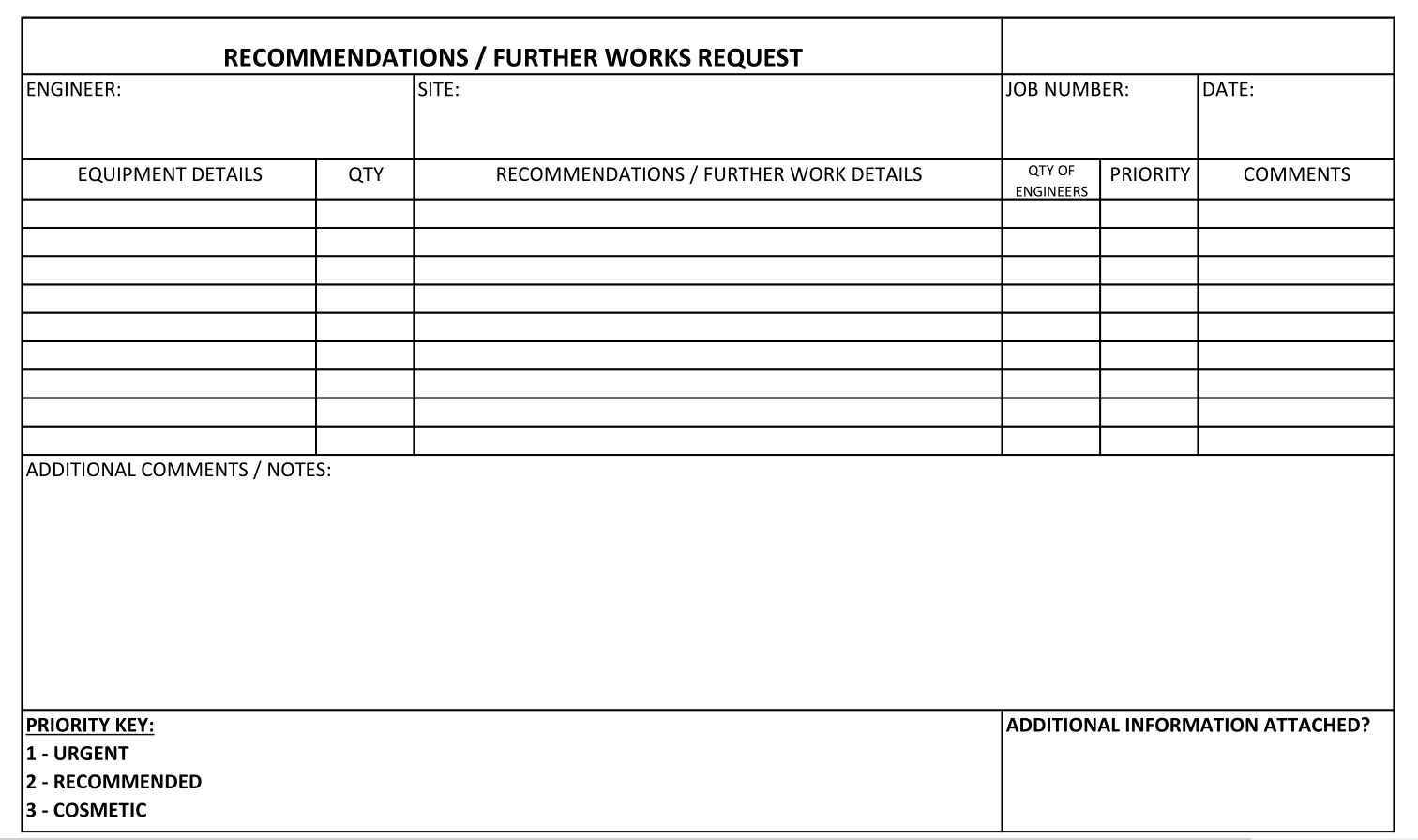
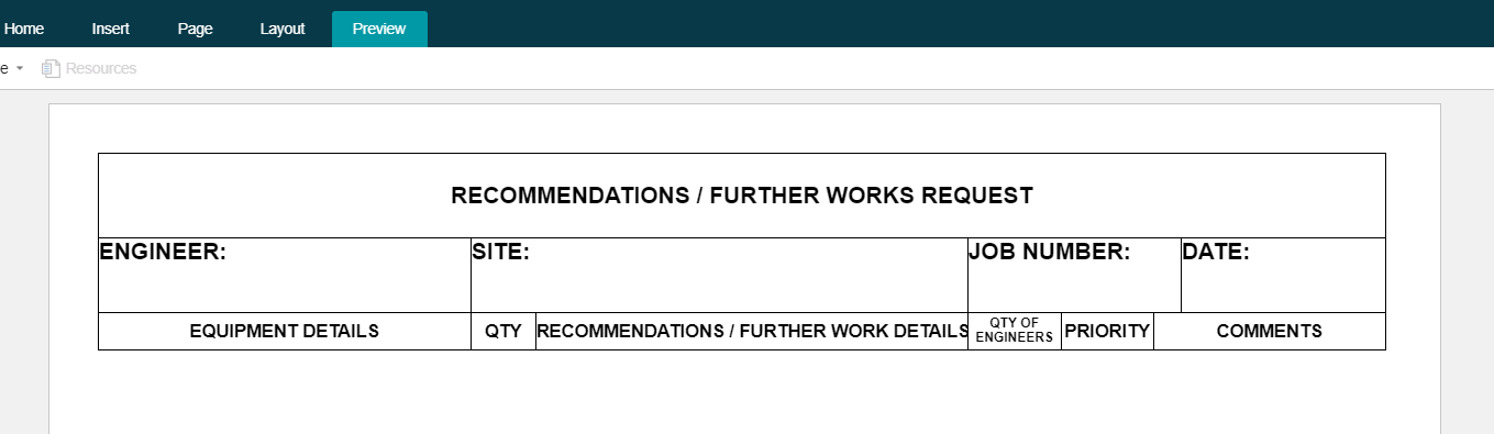
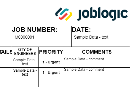
In this scenario we are looking to produce output matching an original paper form with the following layout:
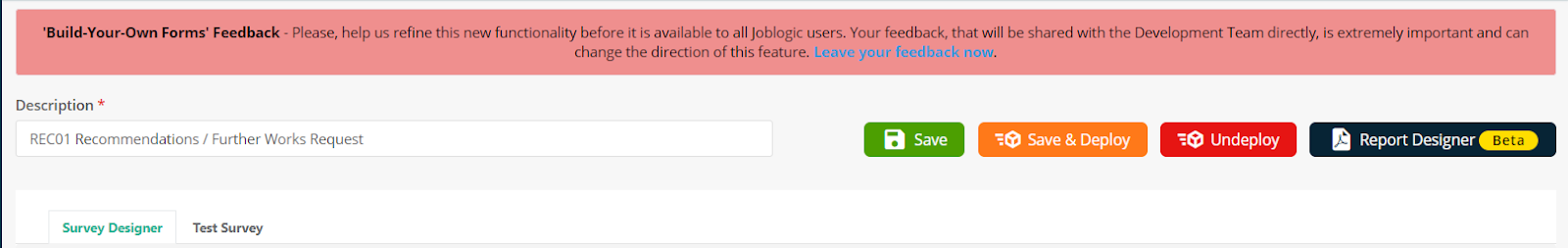
To access the Report Designer. You must edit the relevant Custom Form by clicking the edit icon to the right of the form listing in the Custom Forms tab within Settings > Electronic Forms:

Click the Report Designer action button at the top right of this screen:
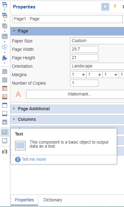
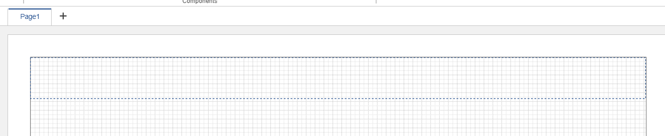
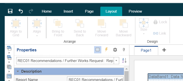
The Report Designer screen will appear:
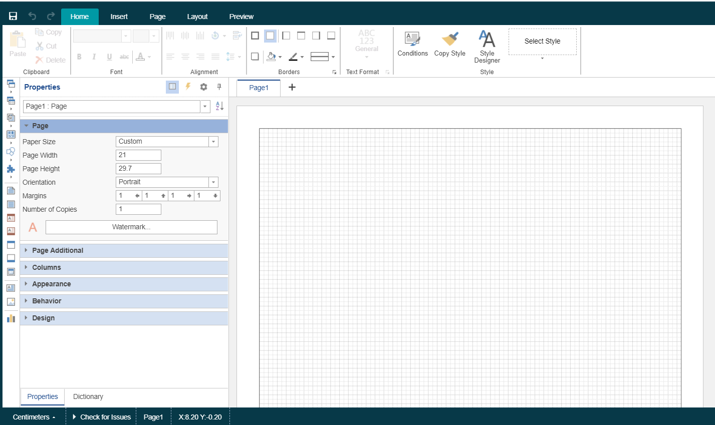
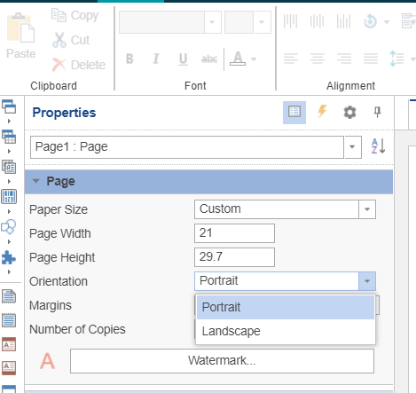
The first setting we want to change in this scenario is the page orientation to Landscape, this can be achieved by selecting the Landscape option in the Orientation dropdown within the Properties panel on the left-hand side of the screen.
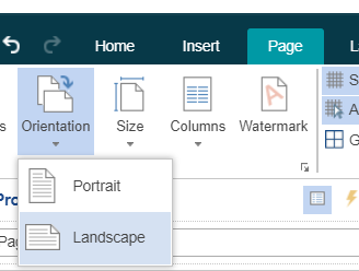
Or via the Page tab > Orientation menu option:
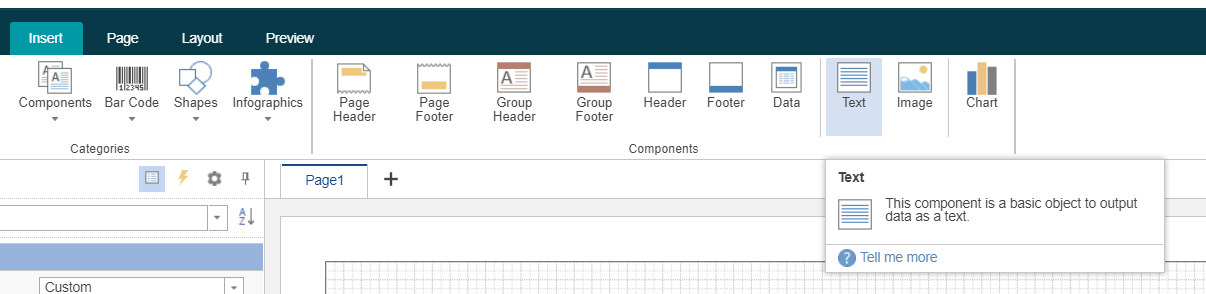
We can now start adding the “hard coded” information into our output (i.e. the static information that doesn’t have to be dynamically populated based on the engineer responses to the custom form questions).
This is via the Insert tab and the relevant menu options:
Or alternatively using the icons on the side of the left-hand properties panel:
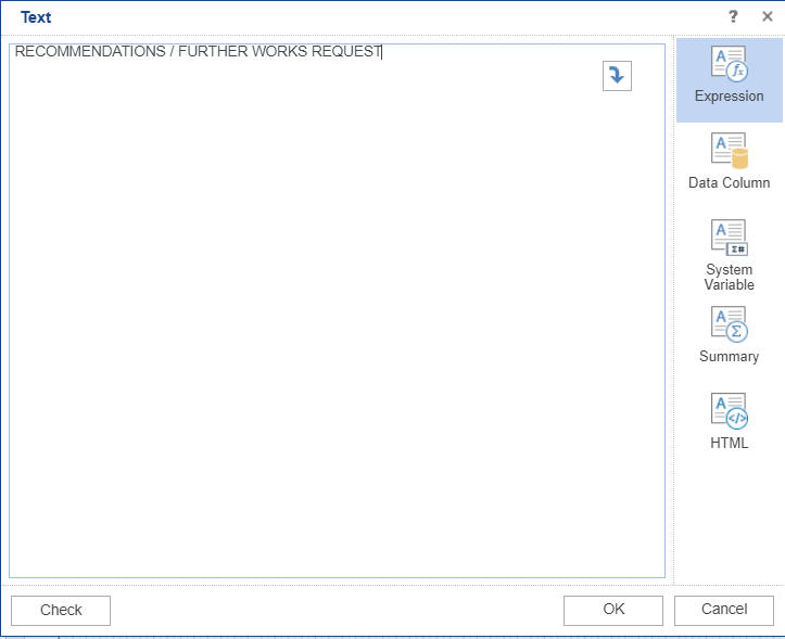
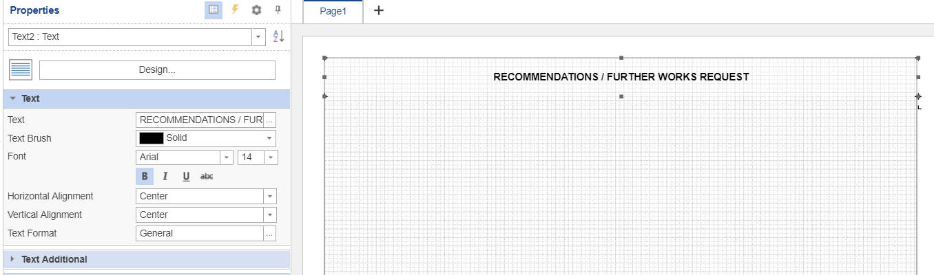
Once the required item has been selected, drag and drop your mouse cursor in the relevant space on the page layout:
The item pop-up window will appear allowing you to edit the required contents:
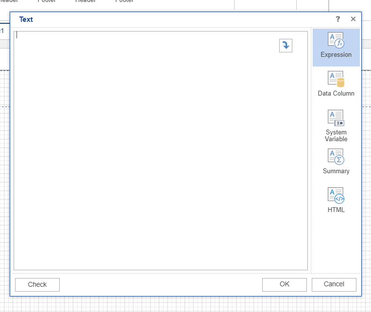
Once you have entered the required text click OK:
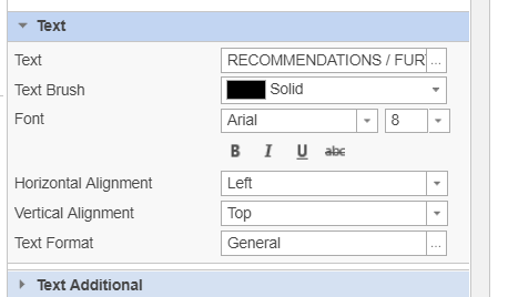
The Text section on the left-hand panel provides you with options to change the font type, font size and alignment options and format for the text:
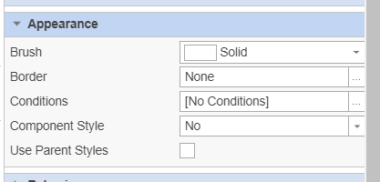
To add borders to the text box you can use the Appearance section of the left-hand panel.
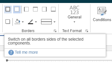
Or the Borders section within the Home tab:
At any point whilst you’re editing the layout you can click the Preview tab to see the results so far:
To populate your output with the responses filled in on the mobile form click the Dictionary tab on the left-hand panel and expand the section for MobileFormHeader > Table1:
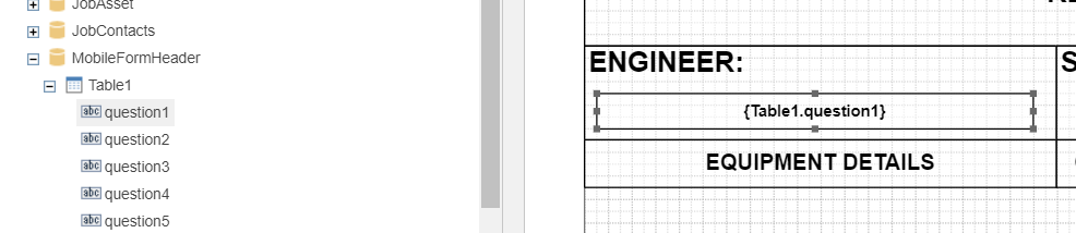
Simply drag and drop the required question from the panel into the layout.
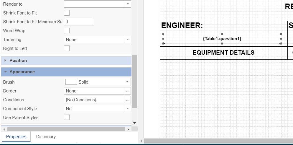
Click back on the Properties tab in the left-hand panel to access the options to modify text styles, alignment and border etc.
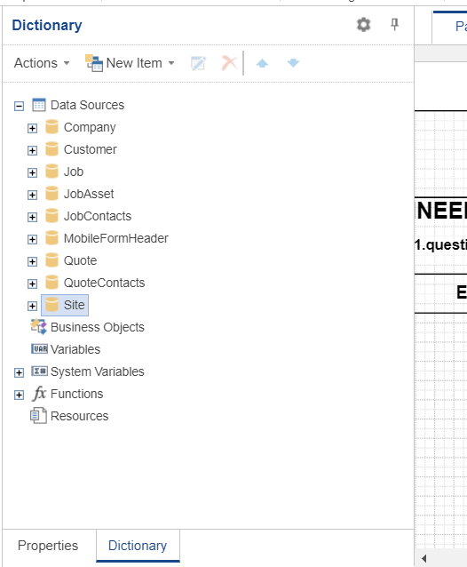
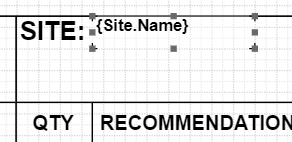
Certain elements can be obtained directly from the Joblogic database and do not require to be added to the custom form, for example, we want to include the site details on this layout. Click the Dictionary tab on the left-hand panel and expand the Site section within the Data Sources section to access the available site fields:
Simply drag and drop the required elements onto the layout
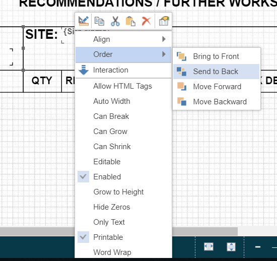
You may need to use the “Send to Back” option in order to access the properties for the required field to do this right-click on the required element and select Order > Send to Back from the context menu that appears:
The properties for the Site.Name field can now be edited.
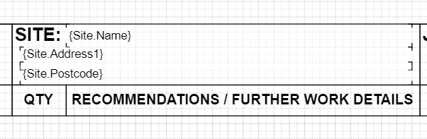
Add the required fields by dragging and dropping or alternatively use the copy and paste function and edit the required field to display:
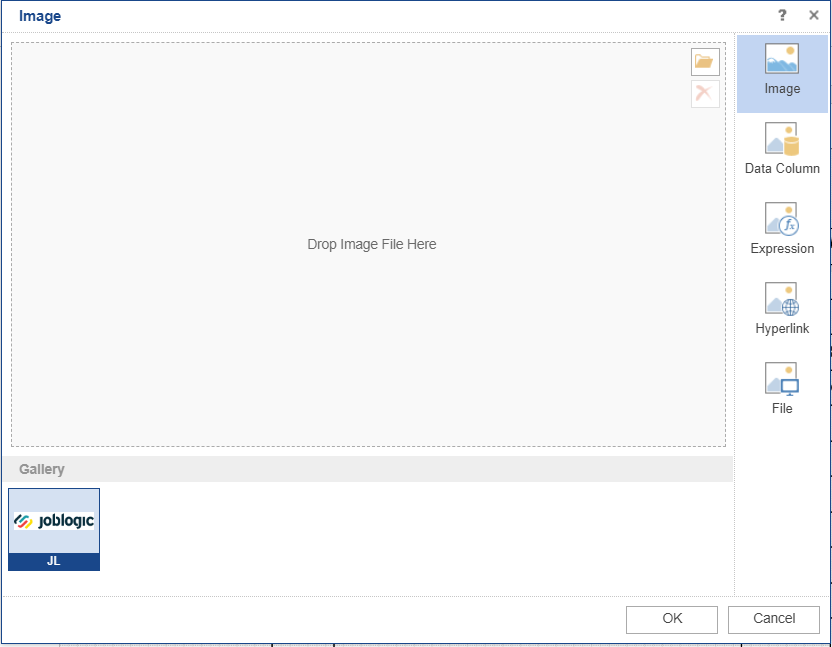
2.1 Adding Images to your Report
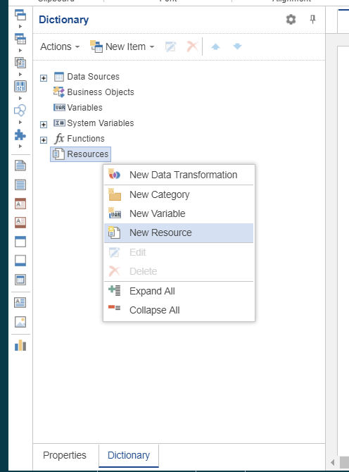
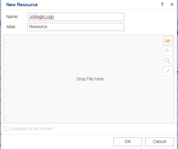
To add an image to your report click on the Dictionary tab in the left-hand panel, right-click on Resources and select New Resource from the pop-up menu:
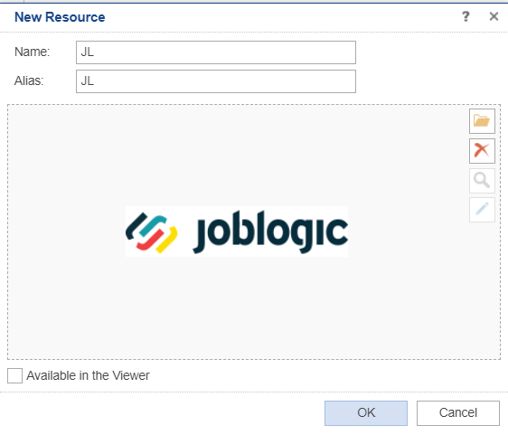
Enter a name for the resource (you can optionally provide an alias too):
Click the folder icon to open a file browser window.

Select the required image file and click OK to save the image as a resource:
Insert an Image component in the required location on your report:
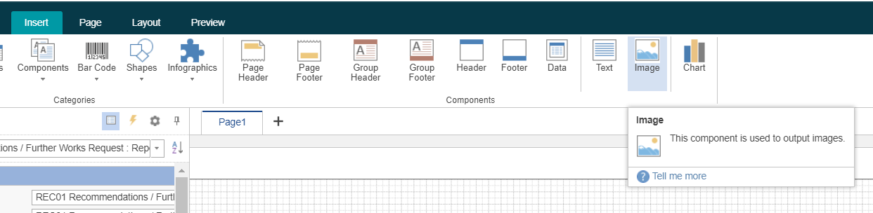
You can select the previously added resource from the Gallery section at the bottom of the Image component selector:
Once you have added all the required elements to your output ensure you click the Disk icon (highlighted in the green square in the screenshot below) to save the changes made:
Viewing a Completed Custom Form
To view a custom form once it has been completed via the engineer mobile app navigate to the relevant job record and select Info > Forms Logbook:
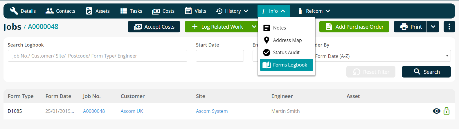
The custom form types are easily identified as they have the “D” prefix within the form type.
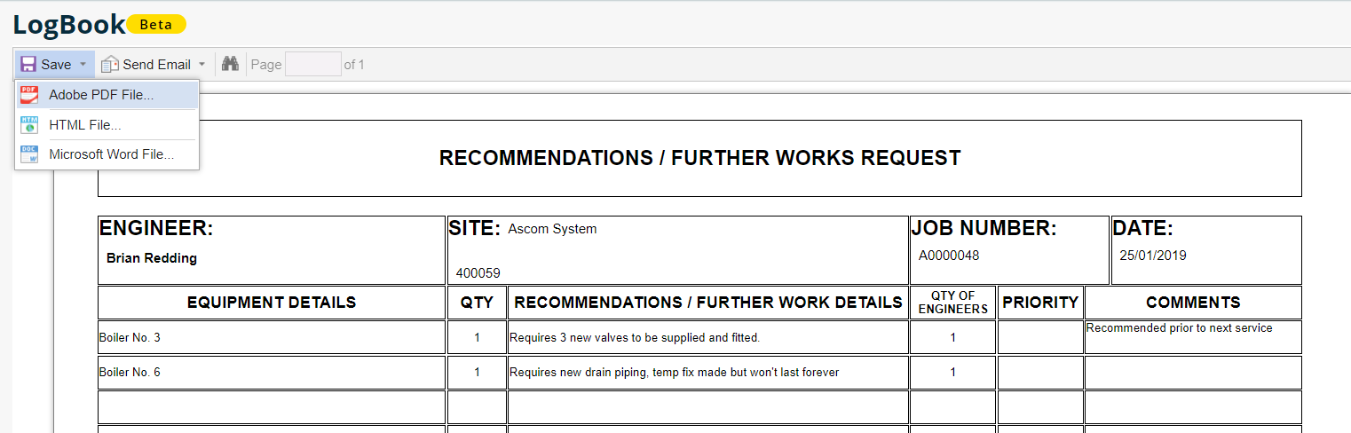
Click the eye icon to preview the form. From the LogBook screen you can select Save and choose Adobe PDF File, HTML File and Microsoft Word File as formats:
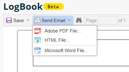
It is also possible to email the form and select the same options for the file attachment:
There are many more features and functions available within the Report Designer.
If you would like additional training on this functionality please contact us on 0800 326 5561 or email training@joblogic.com to discuss the available options.
Further Support
For further information or assistance with the above, contact our Support Team on 0800 326 5561 or email support@joblogic.com. Alternatively, our Customer Success Management team can be reached by emailing customersuccess@joblogic.com
Publishing Details
This document was written and produced by Joblogic’s Technical Writing team and was last updated on the date specified above. Be aware that the information provided may be subject to change following further updates on the matter becoming available or new releases within the system. Additionally, details within the guide may vary depending on your Joblogic account’s user permissions and settings or the electronic device being used